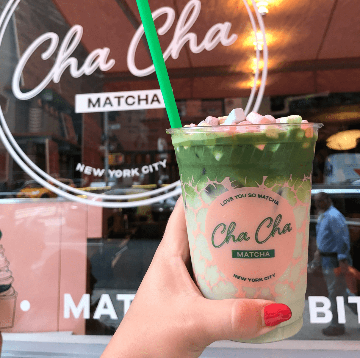
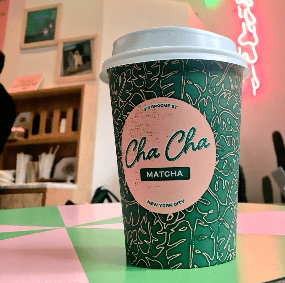
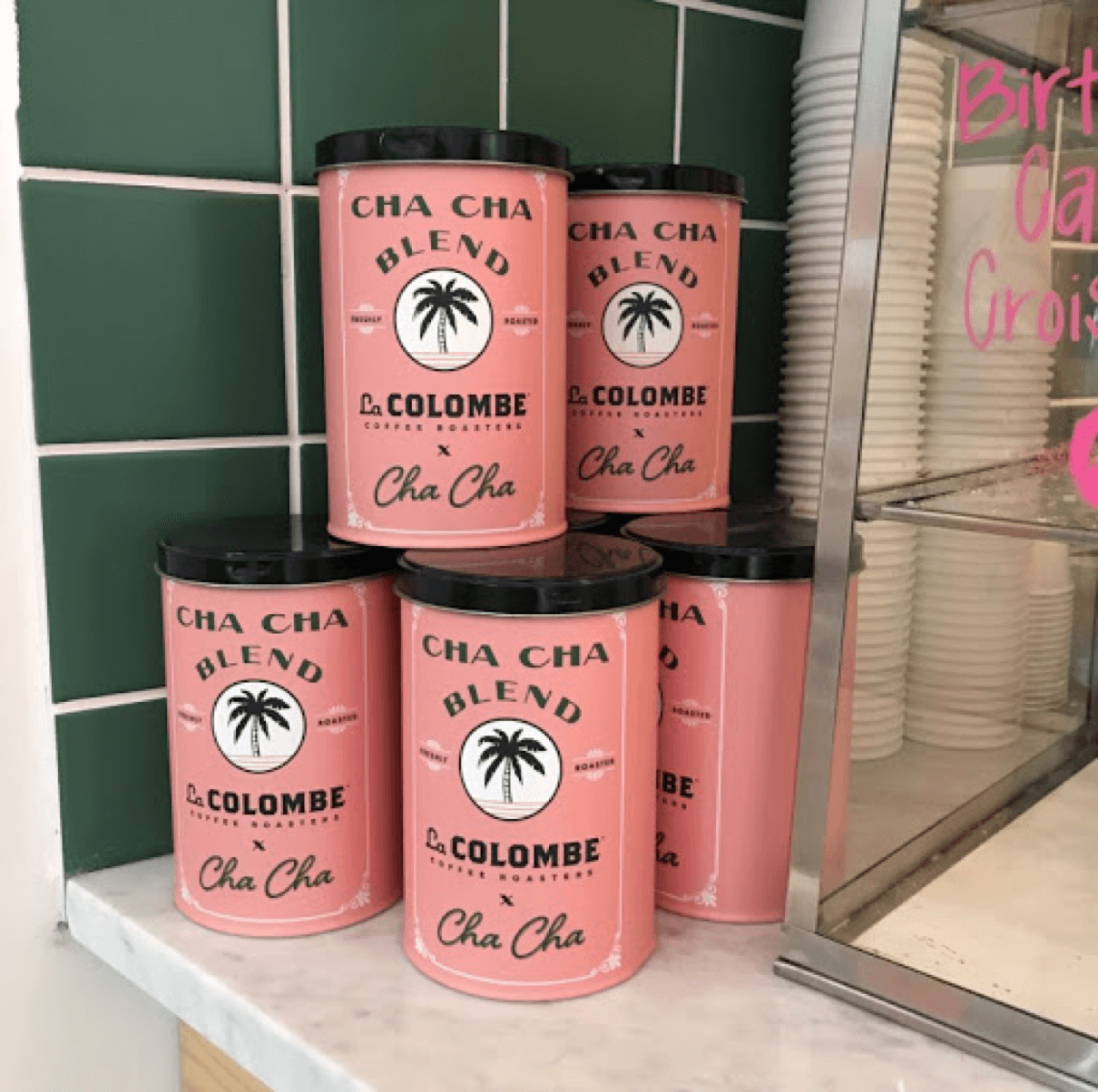
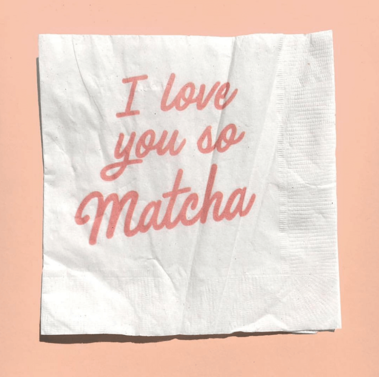
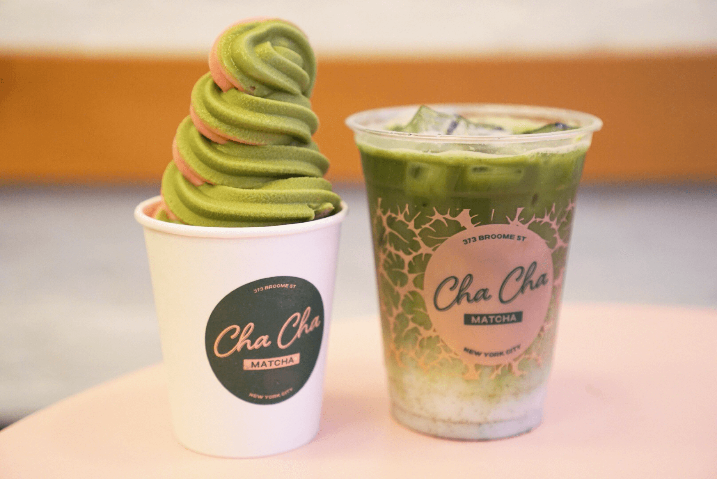
Cha Cha Matcha creates delicious matcha products, which can be enjoyed direct to consumer or at one of their several cafés in competitive, downtown New York City. They wanted a clean logo that reflected their playful personality, so their brand and stores would stand out in a saturated market. Our branding experts created a logo that broke matcha out of its traditional box, drawing influence from South American jazz album covers and minimalist Scandinavian design. We then designed a series of CPG branding and packaging, which extended to in-store necessities such as storefront decals, napkins, containers, and more.
The matcha that loves you back
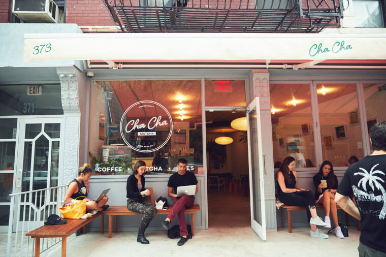
We broke Cha Cha Matcha out of the branding standards set by their industry for the better
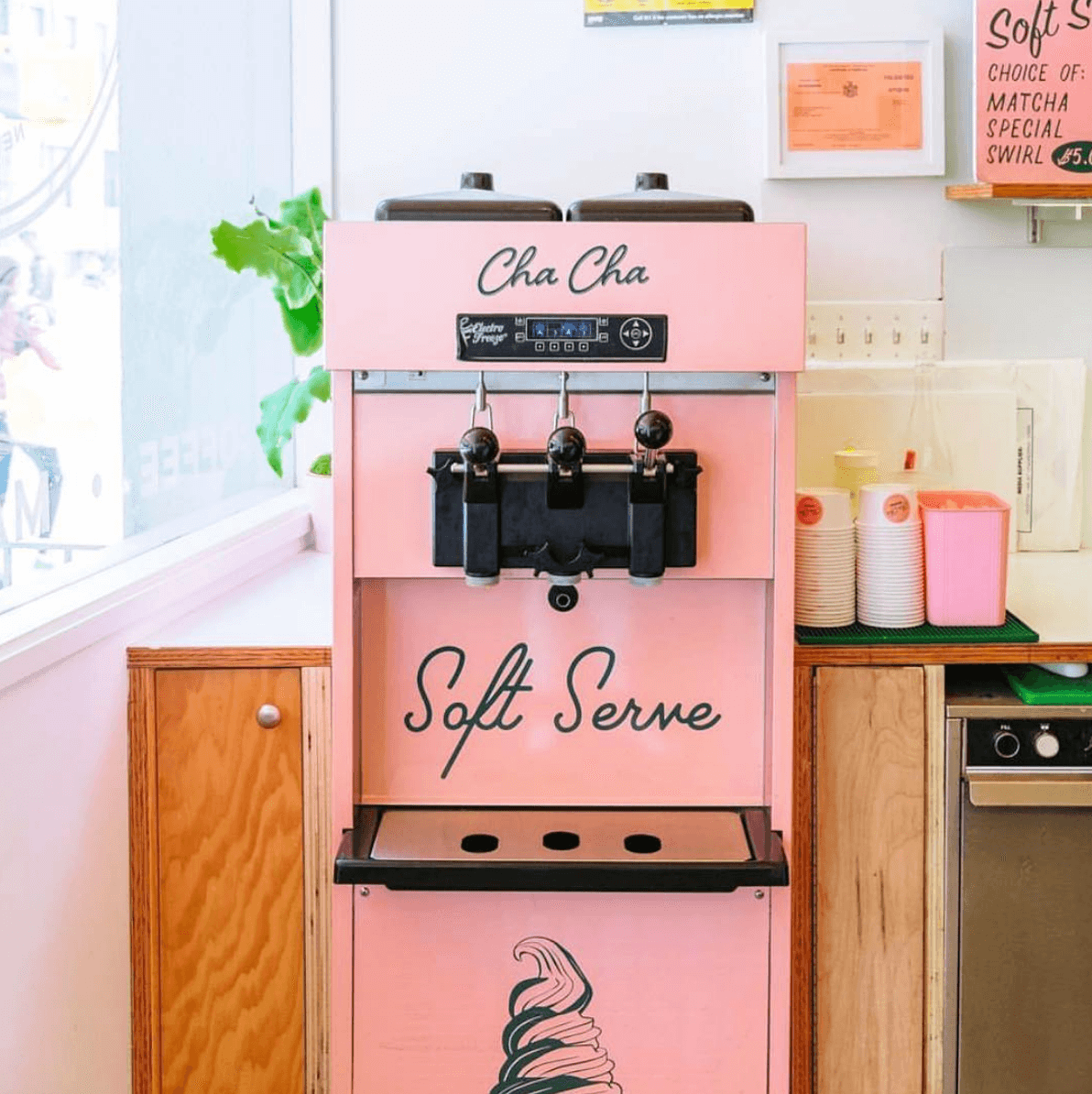
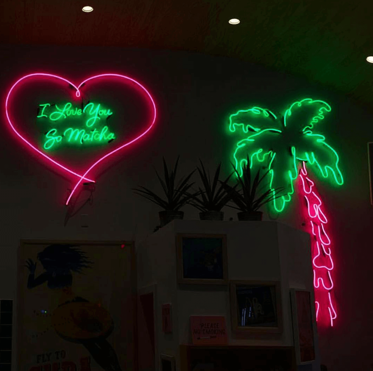
Through research and experimentation, our design experts developed a unique logo that fits the brand’s music-inspired aesthetic. Once we had this foundation, we expanded it to the interior of Cha Cha Matcha’s store, including illustrative signage and fun decor. In collaboration with the Cha Cha founders, we created a cohesive and immersive brand experience that has taken over Instagram.
Another man’s treasure
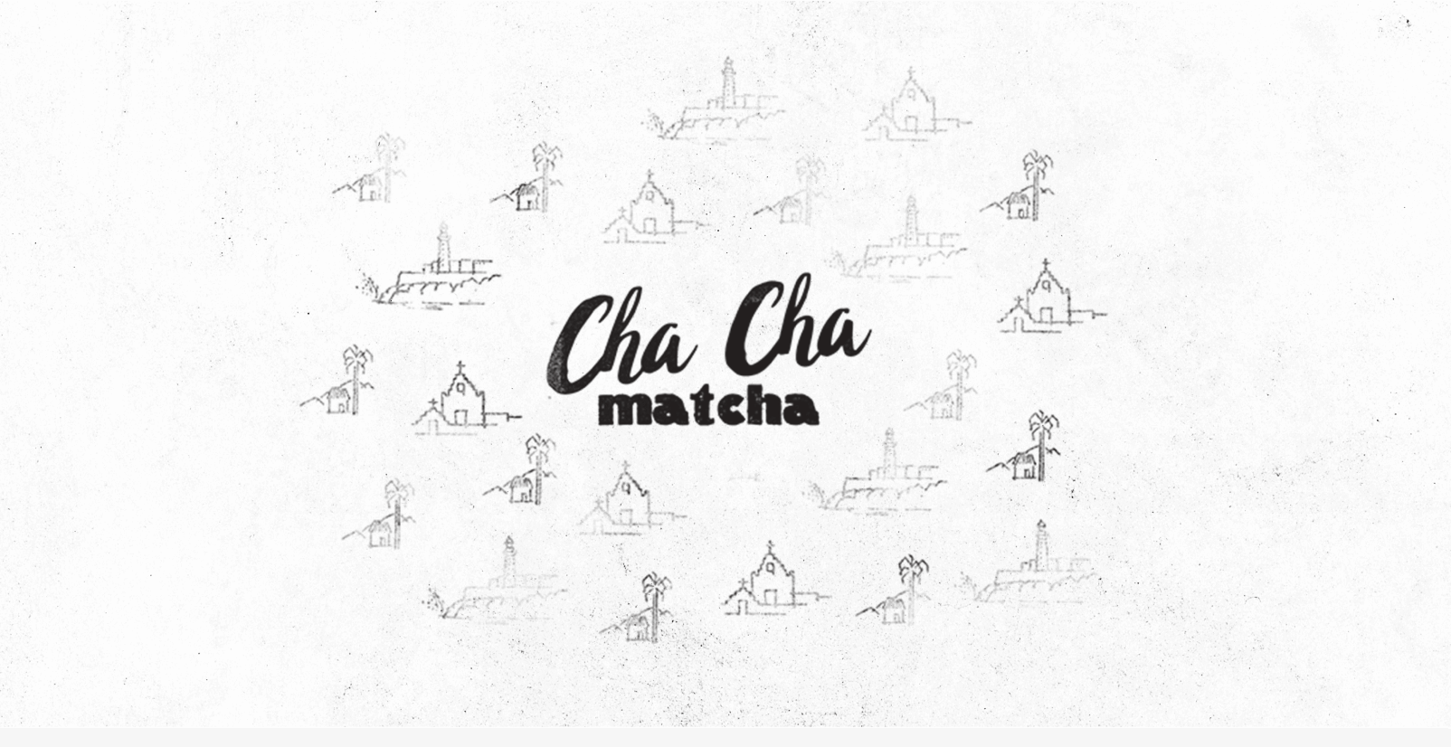
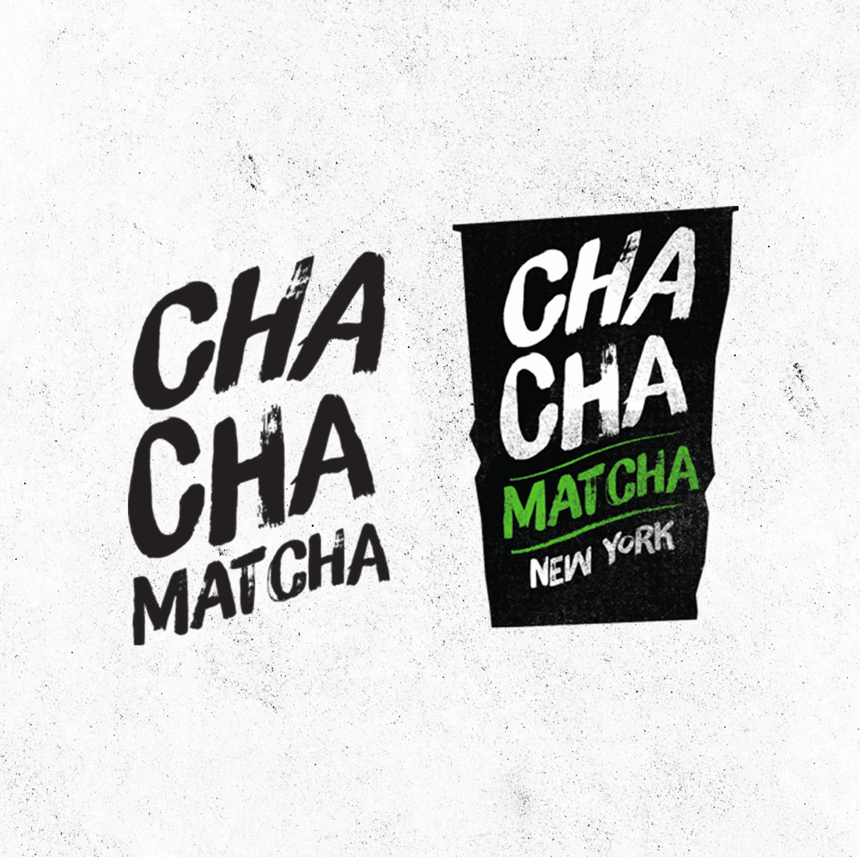
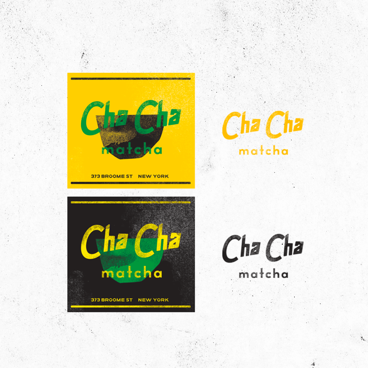
We experimented with several potential directions before landing on the final design. In the research stage, our designers tried out different stamp-like textures, brush strokes, and typefaces, all reminiscent of Salsa and/or the art-deco movement. Even though not all of these designs made the cut, we’re excited to share a peek into the creative process.


A little jazz
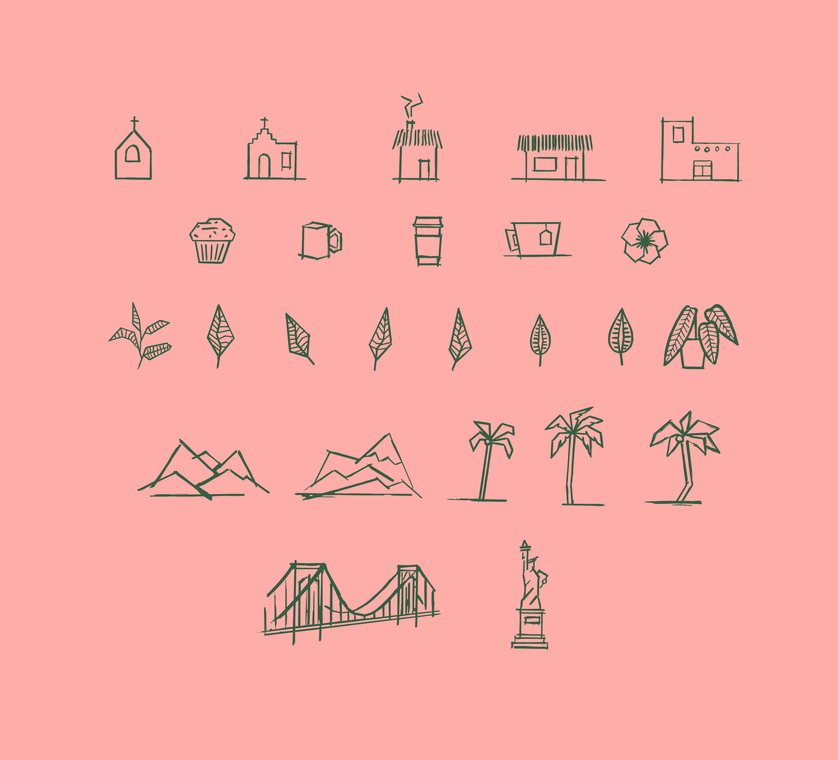
To expand the Cha Cha Matcha brand world, we illustrated a series of custom icons. Each one is playful with a slightly Cubist vibe, combining scenes of NYC and the tropics through a vintage Latin lens.
From brand to icon
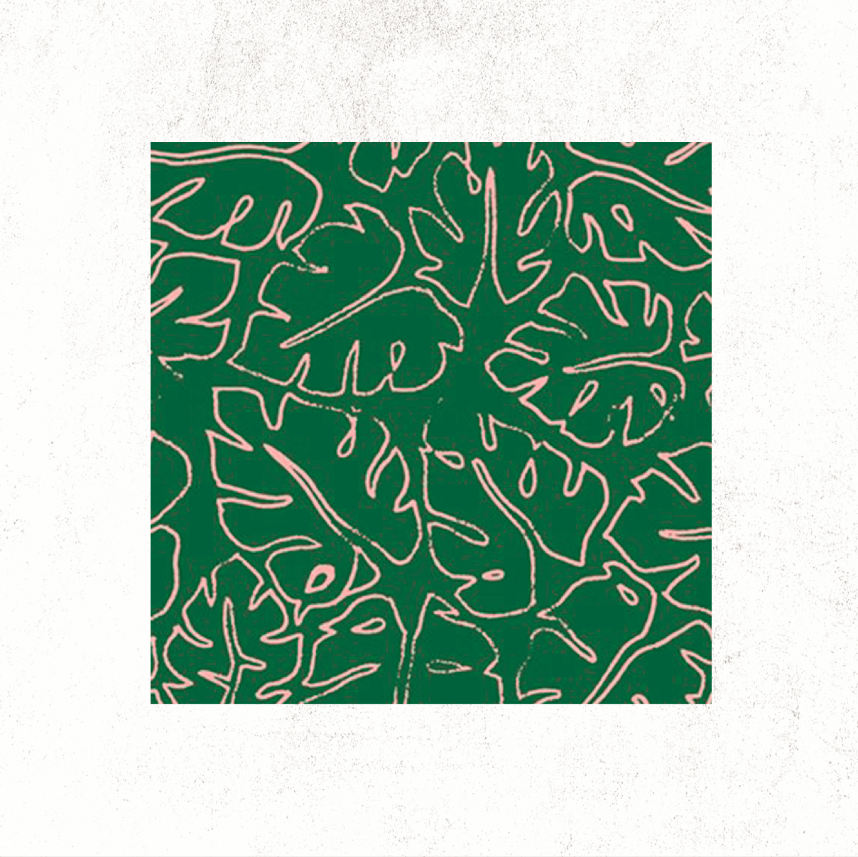
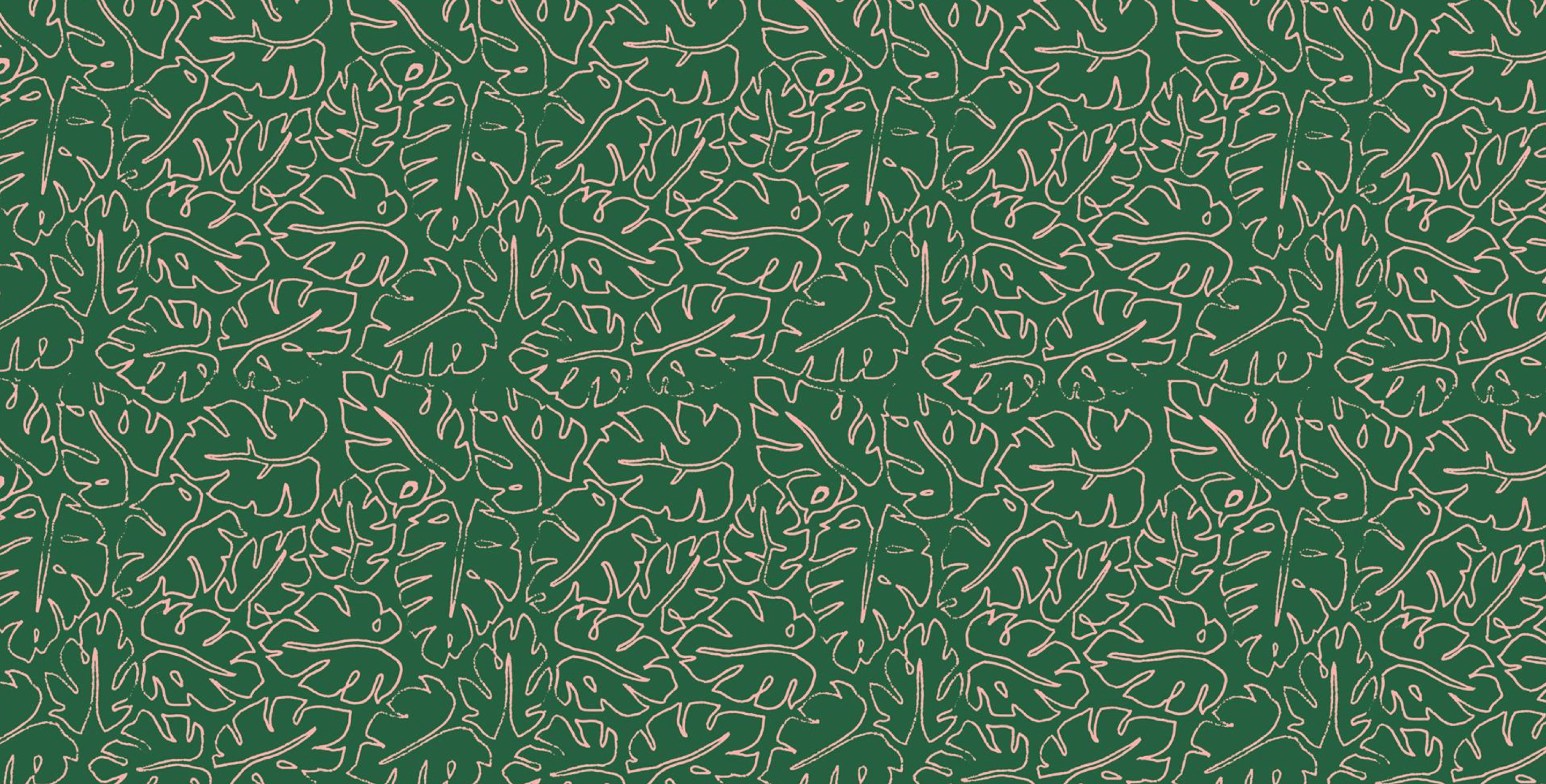
Once we had all of our branding elements, we were able to synthesize them in our designs for Cha Cha’s hot and cold to-go cups, napkins, blends, and more. Our goal for the collateral was to speak to the hip, informed matcha drinker without alienating the casual dabbler and newcomer. We wanted to create packaging for NYC tastemakers to flaunt on fashion week, for the matcha first-timers who would be excited to post it on their Instagram, and for everyone in-between. Inspired by plants and the color of matcha itself, the designs are friendly and pop in just the right way.

