Remember when kombucha was shrouded in obscurity, and you would see one or two brands dominate a small area of the refrigerated section in your local Whole Foods? It was around this time, when Health-Ade Kombucha, a staple booth in LA farmers’ markets, got in touch with us for our expertise in strategy, identity, and web. We set brand parameters that were grounded, classic, and conscious from which we anchored all of our decisions. We positioned them as the go-to kombucha brand that has evolved into an industry touchstone.
A symbiotic relationship
We make solid strategies from where brands grow
Our agency was already privy to the kombucha underground and considered ourselves members of the target audience. Our background imparted us with some insight as we established our objective in bringing kombucha out of the niche corners of co-ops and into the center of the health & wellness market. After some comprehensive market research, we discovered that Health-Ade needed to concentrate on their efforts in sustainability and sourcing practices. This leveraged Health-Ade as a leader in the conscious brand lateral.


A character study

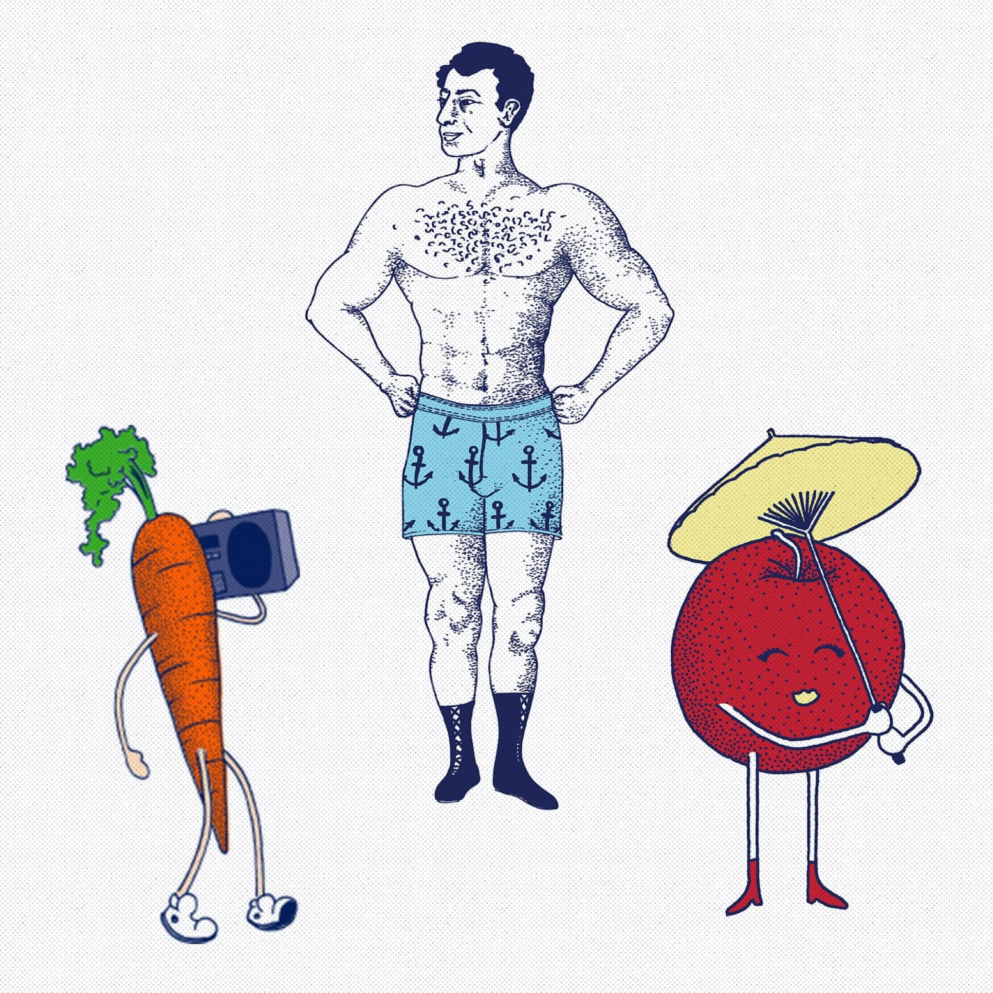
Different times, same culture
Our relationship with Health-Ade was one where we grew together. As ecommerce trends shifted with the times and the kombucha market grew rapidly, Health-Ade needed a platform that could keep up and we were honored to be their agency partner for three different variations of their websites.
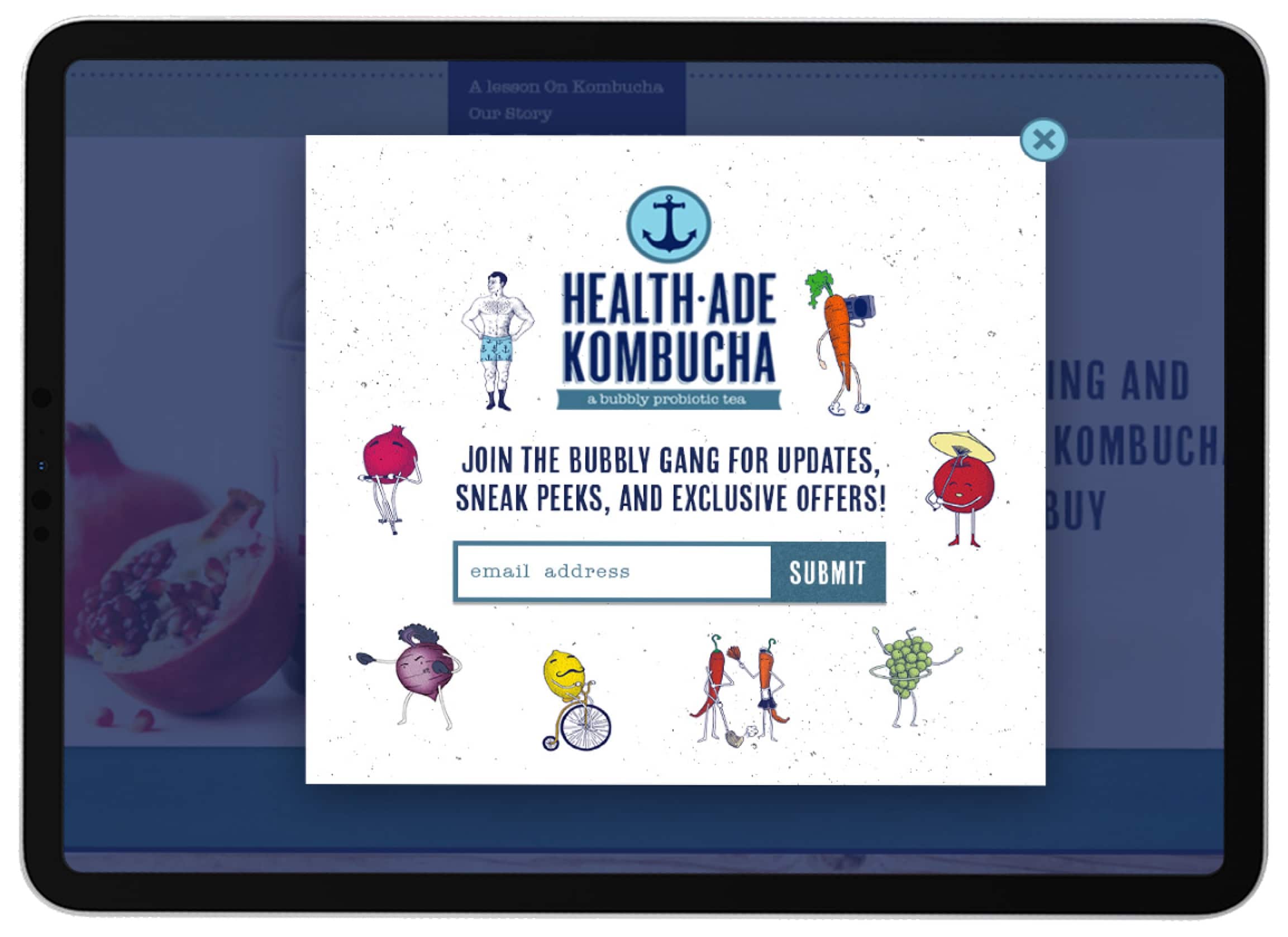
1.0
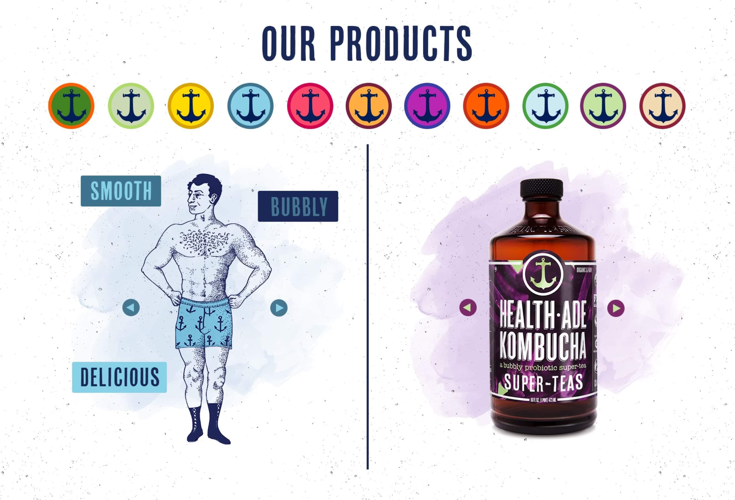
Designed and developed in the early 10’s, Health-Ade’s first site relied heavily on the nautical theme and illustrative style of their identity to help focalize the product. Diagrams and lifestyle photography are used to educate users on what kombucha is and its many health benefits. This indicates that Health Ade’s audience at the time was still trying to grasp what was so dang special about fermented tea.

2.0
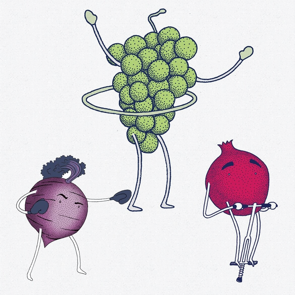
For this direction, we maintained the eccentric, illustrative feel of their early branding and identity but balanced it out with lifestyle photography and more advanced functionalities. As Health-Ade expanded its market and emerged as an industry leader, we were sure to create a website that would help them stand apart from other kombucha giants.

3.0
In this iteration, we took an approach that was cleaner, sleeker, and distinguished Health-Ade as a leading kombucha brand while incorporating some of their tried and true brand elements like the illustrations. This most current build presents a foundation that can withstand a brand that’s continuously growing.

Crisp as the beverage itself
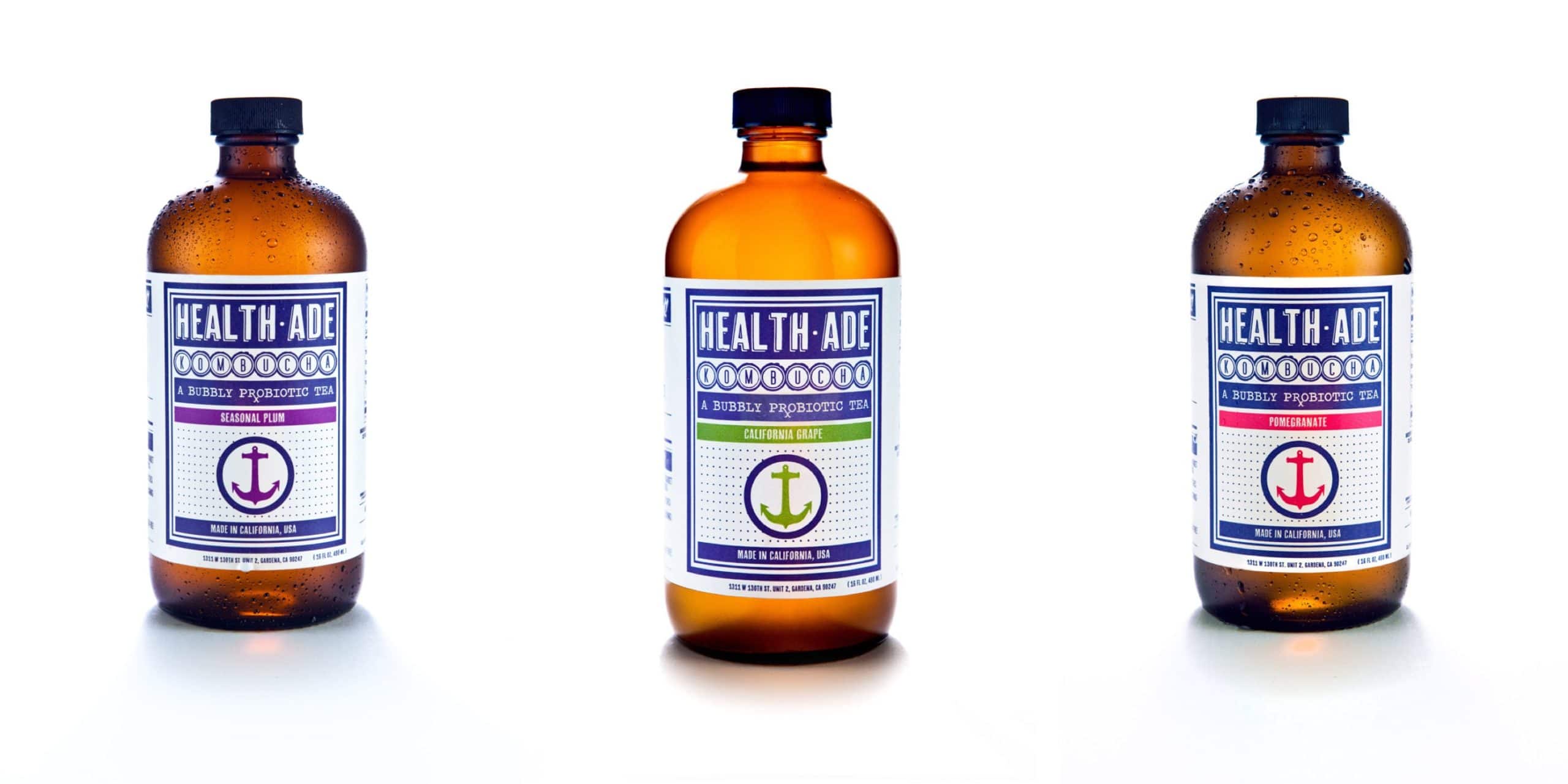
Health-Ade’s bottles have served as an extension of their brand through high-quality, recyclable materials and well-designed labels from the get-go. Our photographers captured these elements by utilizing monochromatic backgrounds and lighting to emphasize shadows and accentuate smaller details like the dewdrops.
