After 30 years as a leading boutique asset manager with multiple billions under management, Litman-Gregory was ready to branch out and undertake a rebranding exercise. The goal was to appeal to a new, younger audience without alienating the core customers that helped them to achieve their elevated status. The result was a beautiful branding and identity package that we then extrapolated to a new website build with clear CTA’s to drive new leads.
Corporate identity with an edge

The bedrock
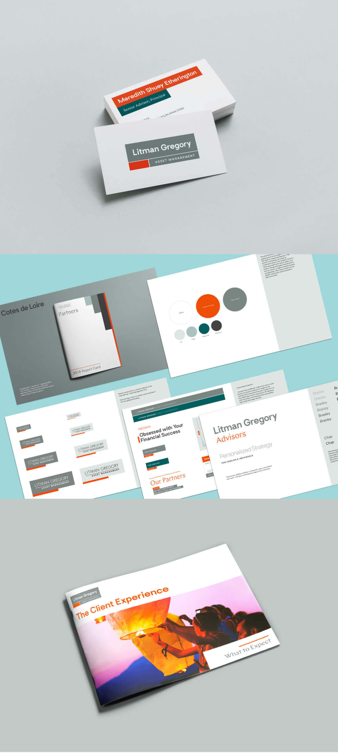
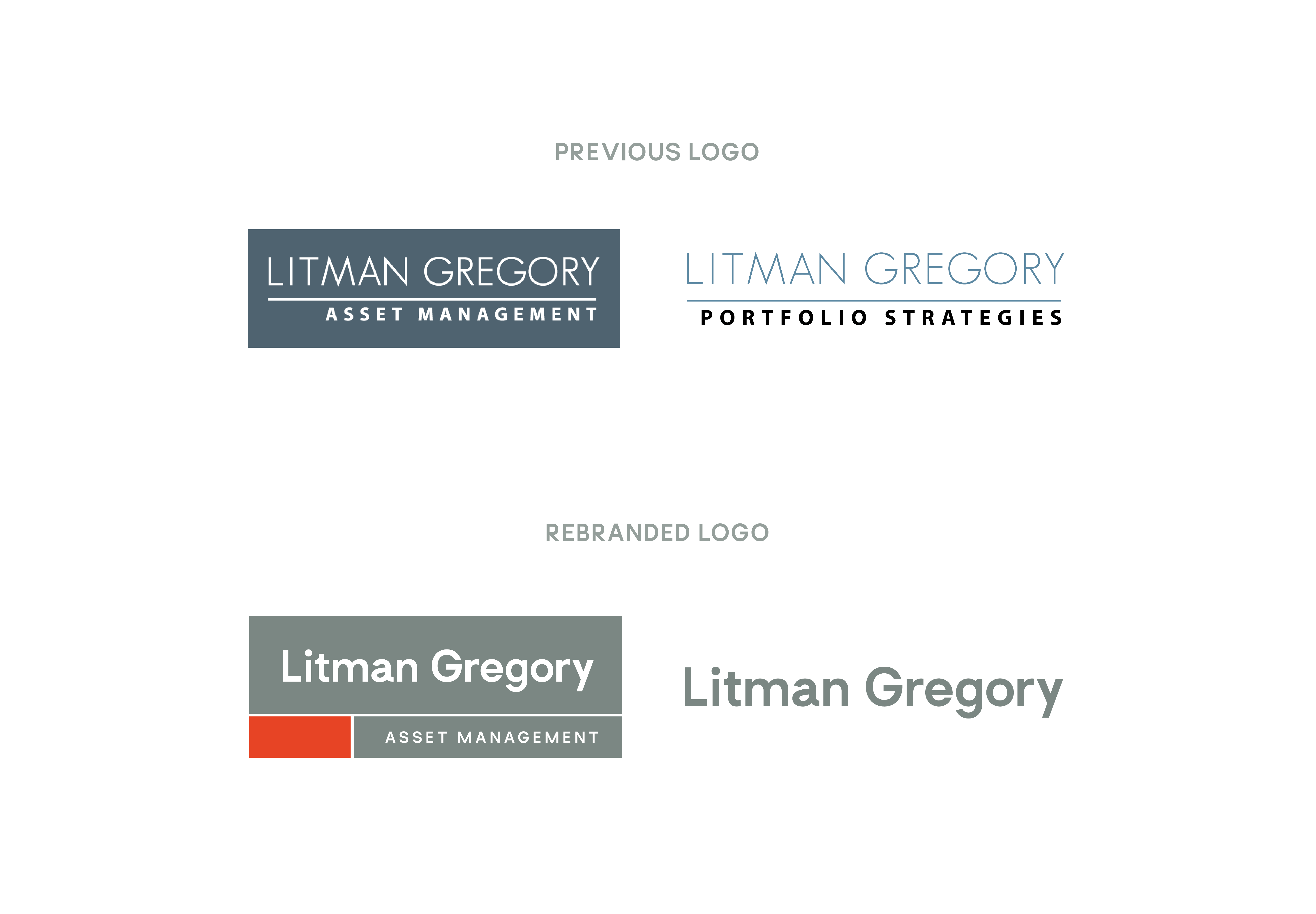
During the rebranding process for LGAM, we explored ways that we could evolve the brand in exciting ways without making it unrecognizable to their loyal customers. To accomplish this, we held on to some of the original components of their logo, keeping the shape the same while experimenting with the colors and forms to create division and balance. To further modernize their logo, we changed the typeface to a thicker sans-serif and the cool blue color to a teal-grey that we accented with a pop of orange. Our branding decision resulted in a new identity that was minimal, modern, and elegant.


Modernizing the best in wealth management
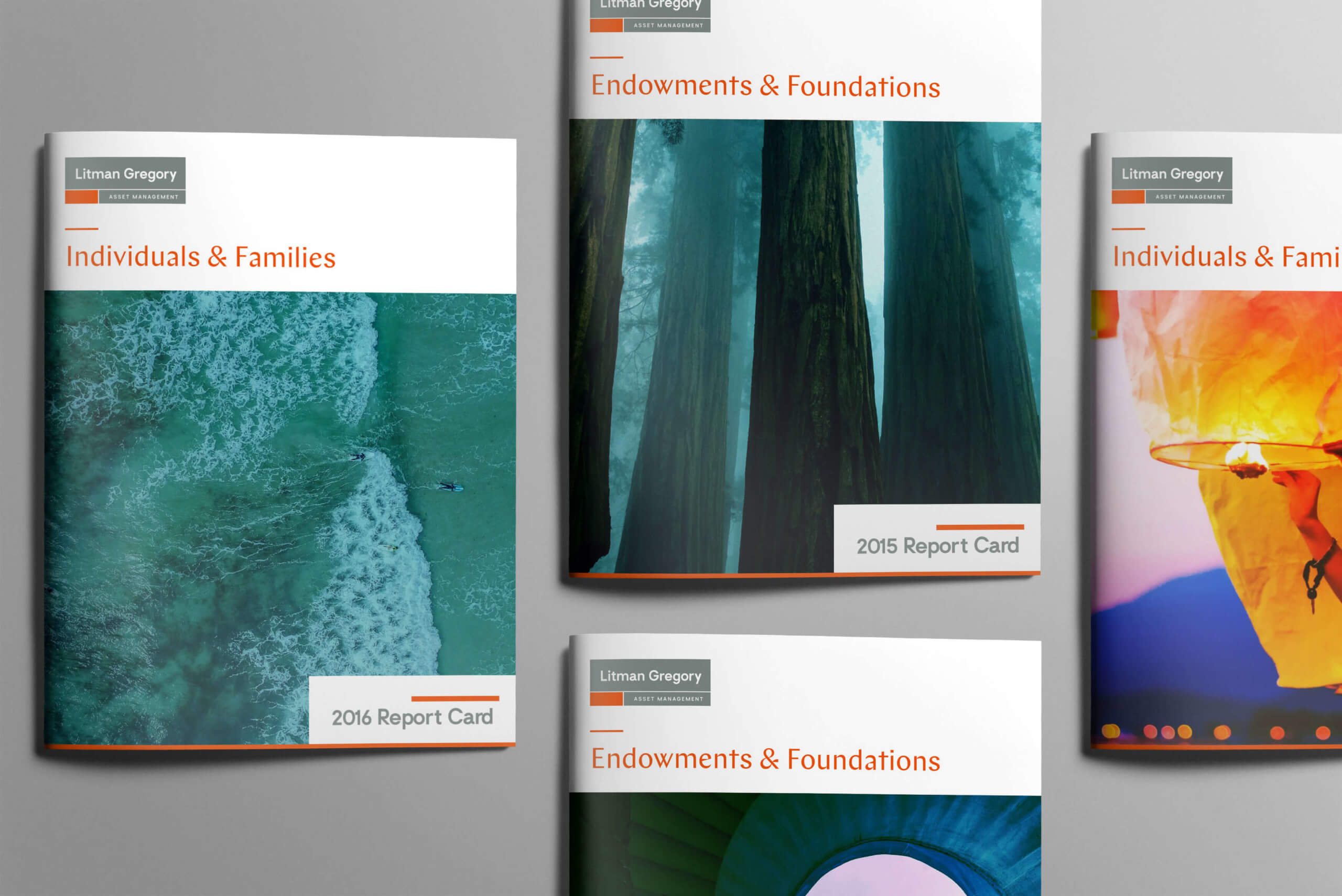
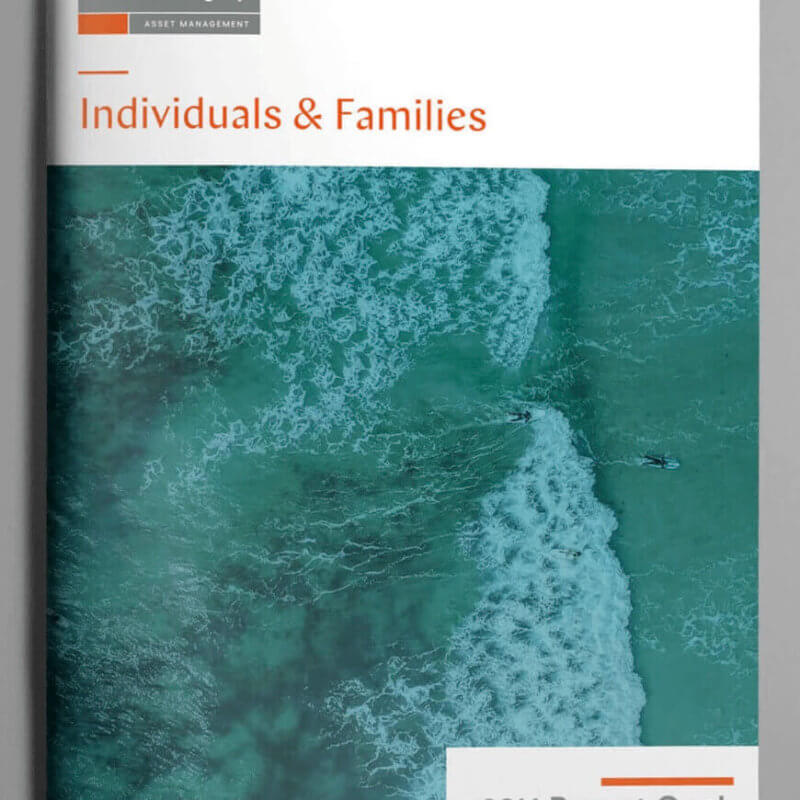
Within every branding project, we form a foundation of data-informed strategy. Our research helped us understand LGAM’s current and future customer base, their needs, and what influences their decision-making. This informed branding elements such as the photography and the illustrations that adorn the site.


Extending the identity
Litman Gregory’s collateral needed to be as professional and elegant as the leading boutique agency itself. Our goal was that the quality of their service would be communicated before the catalog was ever opened or before the business card was ever flipped over. This branding even extended into templates for their presentations.