
Wake & Late knew they needed branding and identity that was on par with the quality of their rad food and dining experience. We needed some truly amazing breakfast burritos in our lives and didn’t know it. We helped solidify their evolution from local hub to scalable DTLA staple.

We didn’t know how much we needed these burritos
Hands-on research
Our lead strategist was already a Wake & Late regular before our involvement on this project, making our strategic analysis four-dimensional. Collectively, our firsthand experience with Wake & Late gave us insight into their values in sustainability and top-notch customer service, as well as their customer base which we were very familiar with). We knew that Wake & Late already had something special. After extensive research in market and customer trends, we found that they needed to direct their focus on sourcing practices and speedy service to help them take their brand to the next level.

The missing ingredient
Wake & Late specializes in speedy breakfast with an emphasis on sustainability and high-quality ingredients (and they do it pretty damn well). Our objective was to equip them with a look that would help them stand out and speed ahead of any others in their lane. We rooted our branding decisions in a data-informed strategy. This inspired us to go with the modern logo that’s a nod to classic diners. It is part of what defines Wake & Late’s authentic, grounded, and local qualities.
We landed a logo that’s classy and playful. The branding was seamlessly incorporated into pieces of collateral and influenced interior branding decisions.

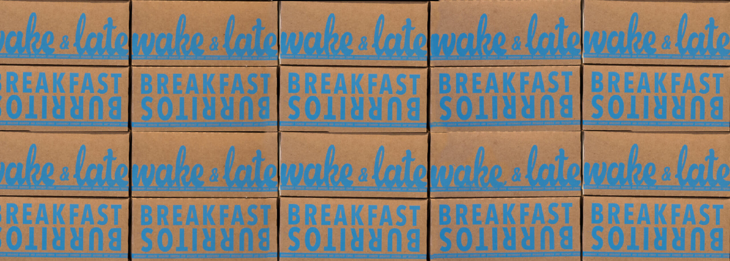
Maybe you’ll keep the box…on your mantel
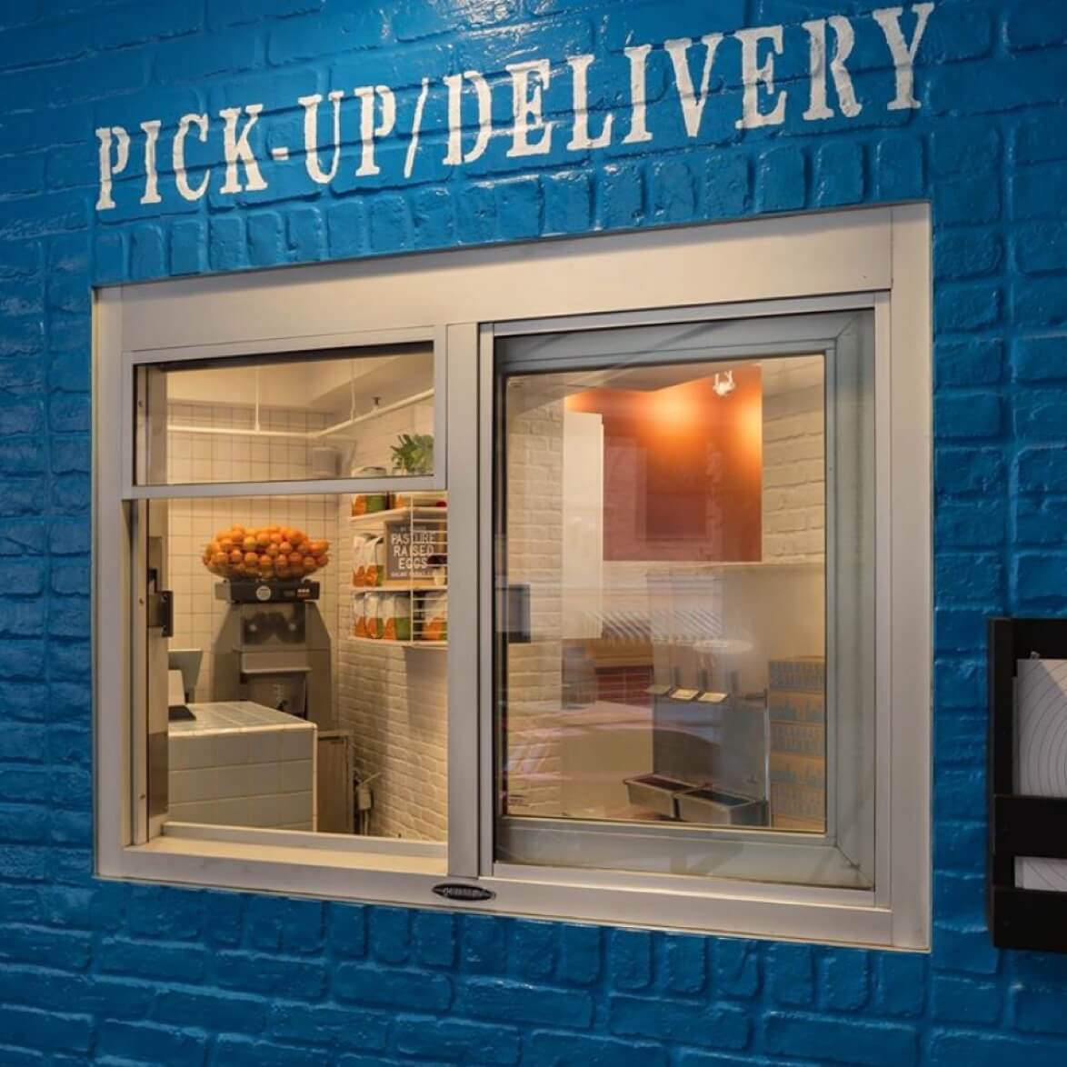
We expanded the horizons of our branding parameters into every piece of collateral from packaging to signage. We created one-of-a-kind menus that are reminiscent of a vinyl cover and showcase our proficiency in user experience. The packaging doesn’t fall short in this innovative touch as we toyed with different arrangements of elements to strike a nostalgic note and a perfect balance. We also brought the logo to life through the iconic signage that hangs over their storefront and faces the DTLA streets. The definitive blue in the sign highlights the blue that accents the rest of the shop and serves as a breakfast beacon for the folks of LA.


Check out more of Manufactur Agency’s projects filed under: branding.