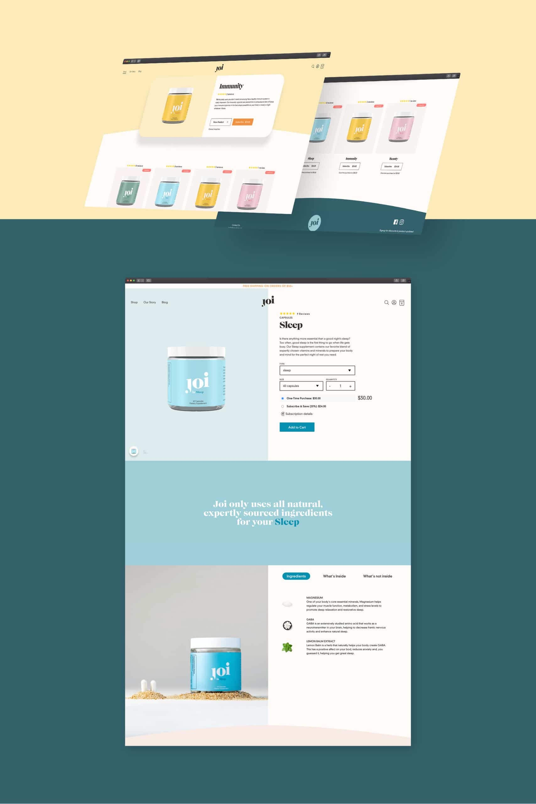
Joi’s taking the ambiguity out of supplements and replacing it with a straightforward product that’s actually natural. For a brand this refined, we helped them realize their vision by building out clean, elegant, and to-the-point website on Shopify.
Custom Shopify for Joi: a brand as transparent as its capsules
To bolster their identity, we took inspiration from elements innate to Joi’s branding to create a cohesive, unified website. Utilizing rounded edges, soft yet captivating colors, and clean typefaces, Joi’s homepage reflects the qualities at the very core of their brand: naturality, simplicity, and effectiveness.

Our approach to Joi’s website was inspired by the simplicity and cleanliness present in nature, with complementary colors chosen for their associations with calm and respite. Our use of simple shapes paired with minimalist photography enabled us to foster a dynamic, textural web presence for the brand that feels both organic and accessible.

“Minimal” doesn’t mean “boring!” Our team worked together to research fun ways to use multifaceted design theories in tandem with simple shapes and colors. Through pop-out blocks, discrete layers, and tactful flourishes, we created a Shopify-based market for Joi that feels interactive and multidimensional.
Check out more of Manufactur’s projects filed under Ecommerce and Web.
